
About the project.
Slabtown Marketing needed a logo that reflected both their strategic mindset and their local roots. As a medical and healthcare marketing and strategy firm, their brand had to communicate trust, intelligence, and forward momentum, without feeling overly corporate or cold. We created a clean, modern mark that carries layered meaning. The subtle upward arrows built into the icon symbolize growth and measurable progress — a direct reflection of how Slabtown lifts healthcare brands. At the same time, the structure of the icon forms an abstract representation of the historic Slabtown buildings in Traverse City, Michigan, grounding the brand in community and place.


Hidden Upward Momentum
Integrated arrow forms subtly communicate brand growth and strategic lift without being overt or distracting.
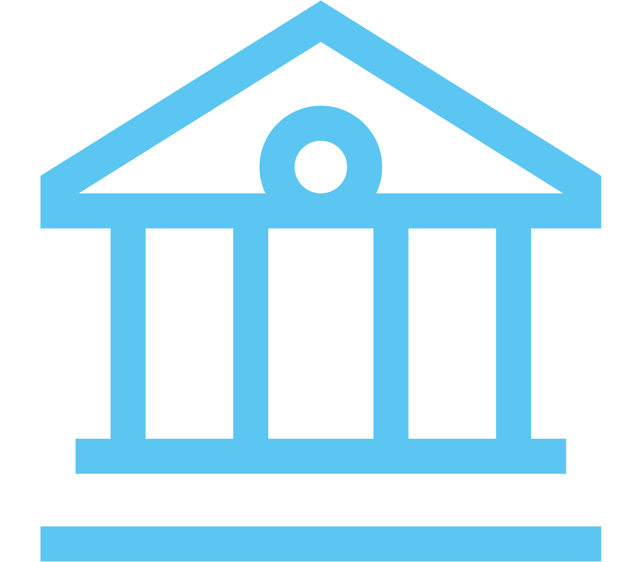
Architectural Double Meaning
The icon mirrors the rooflines of historic Slabtown buildings, tying the brand to its Traverse City heritage.

Strategic Identity System
The minimal, structured design feels professional and credible — ideal for the medical and healthcare marketing space.

How it helped.
The final logo gives Slabtown Marketing a confident, strategic identity that stands comfortably in the healthcare space. The upward structure visually communicates elevation and brand growth, while the architectural silhouette reinforces stability, heritage, and foundation. This dual meaning strengthens their story: rooted in Traverse City, focused on lifting healthcare organizations forward. The clean typography and balanced iconography make the brand feel credible, modern, and thoughtfully constructed.
Let’s Get Started
Ready to make a splash with your brand? Start a project with us today and together we’ll chart your course to success.